VSSMN - case study under construction
client project • responsive web design
client project • responsive web design
client project • responsive web design
client project • responsive web design
Working with client's existing branding to reinventing the online experience for immigrants and volunteers.
Working with client's existing branding to reinventing the online experience for immigrants and volunteers.
Working with client's existing branding to reinventing the online experience for immigrants and volunteers.
Working with client's existing branding to reinventing the online experience for immigrants and volunteers.
view final prototype
Client
Vietnamese Social Services of Minnesota
Role
UI / UX designer
and researcher
Timeline
4 weeks
Tools
Figma
CONTEXT
Although VSSMN had a strong physical impact, they lacked a digital presence representative of their organization.
VSSMN is a non-profit social services organization that provides resources, programs, and social support to the Vietnamese immigrant community in Minnesota. They strive to empower and equip immigrant families with tools needed to become thriving members of society.
Problem
How might we help eager users easily discover new and lesser known scenic views?
research
A look at VSSMN's current web presence
Users utilize search engines (i.e. Google) to search for locations, but the experience is riddled with friction and frustration. The gaps within the experience reveal major improvements for building our service.
secondary research
Research highlighted the importance of a well established, trustworthy, responsive website that optimizes mobile usage

75% of users judge the credibility of an organization from their website presence and design (Stanford Web Credibility Research).
75% of users judge the credibility of an organization from their website presence and design (Stanford Web Credibility Research).

Donations online increased by 21% in 2020, compared to the previous year (Nonprofit Source).
Donations online increased by 21% in 2020, compared to the previous year (Nonprofit Source).

Website usage for social service organizations increased by 42% in 2020, compared to the previous year (Statista). Within that movement, 50% of traffic to non-profit websites are from mobile access (Nonprofit Source).
Website usage for social service organizations increased by 42% in 2020, compared to the previous year (Statista). Within that movement, 50% of traffic to non-profit websites are from mobile access (Nonprofit Source).
competitive analysis
A focus on information architecture, features, and professionalism of existing non-profits
Many of our direct competitors lacked well structured IAs, so I extended my research to indirect competitors - well established non-profit websites with strong digital platforms.
user interviews
3 immigrants between 25-60 years old with past involvement with social services and 2 volunteers between 25-60 years old.
ideation
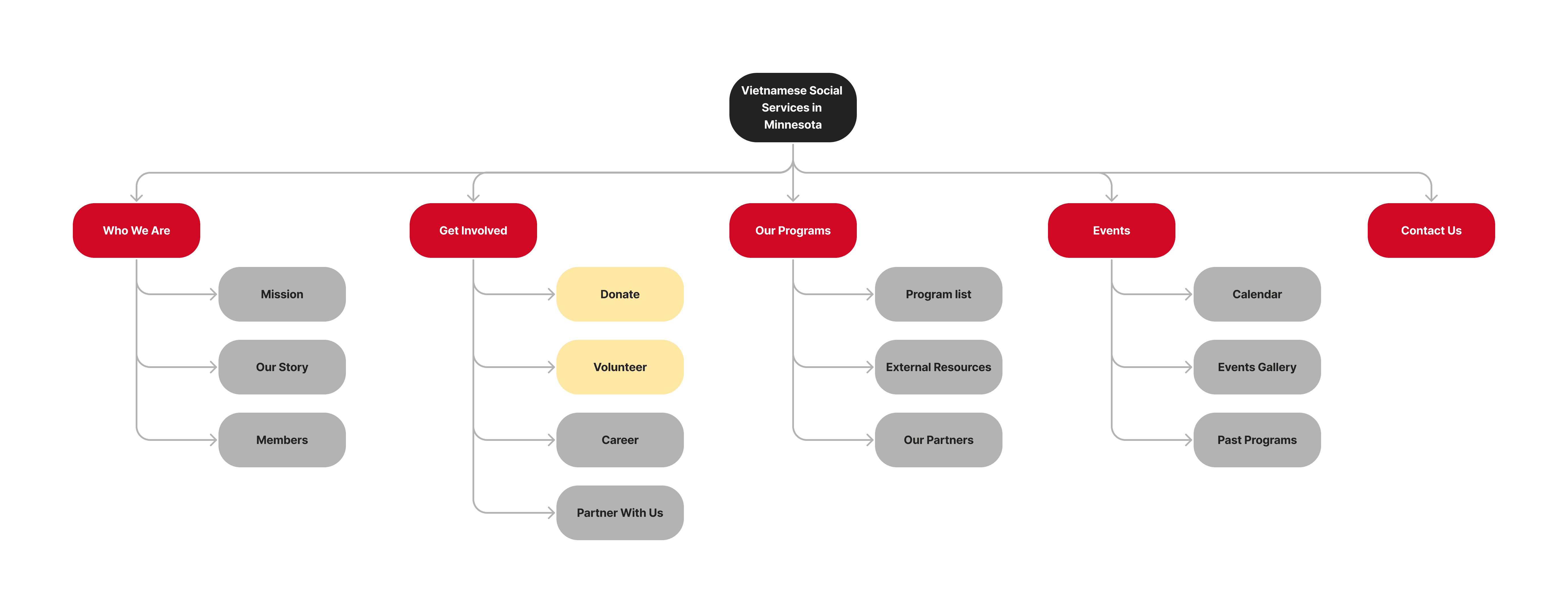
Information architecture rebuilt for better structure and user flow.
wireframes
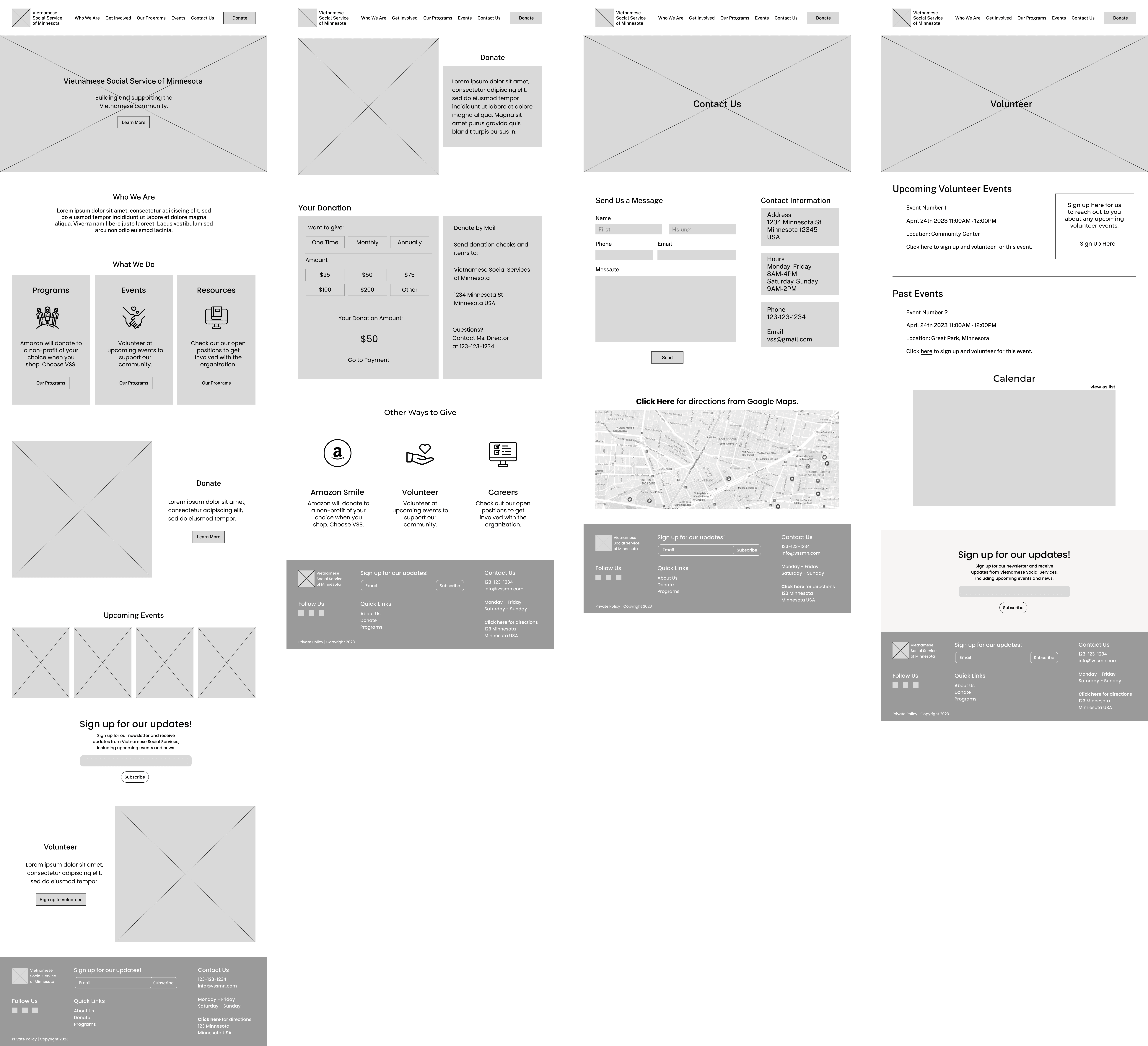
Getting into the wireframes, styles, and design
Through competitive analysis and a look into our persona Amanda's wants, I prioritized the must-have features of a functioning location service and the essential task flow - to search and arrive at a newly discovered location.
styles
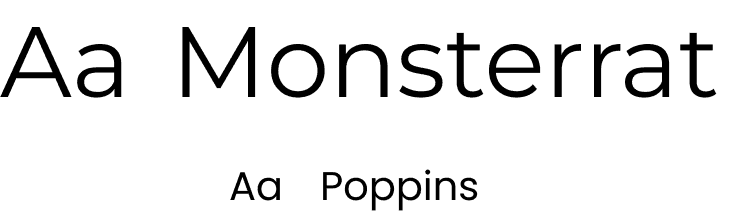
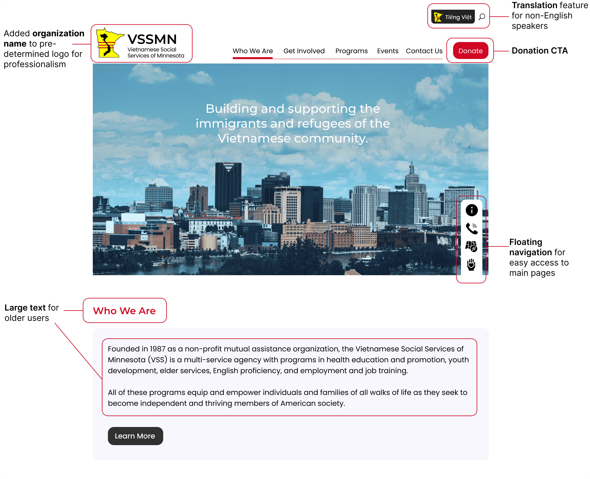
Working with design constraints for better branding.
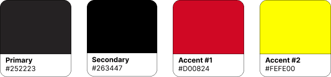
VSSMN colors were limited to its current logo, so the design constraints consisted of a pre-determined color palette and logo. I wanted to make sure that the site utilized these accent colors to the best extent without busying each page. Therefore, I opted for red as the primary accent color for all CTAs.
USER TESTING
User testing conducted on mid-fidelity designs with 100% task flow completion amongst users.
1. Donate CTA and search buttons were too close for users to access easily.
2. Users missed the translation option and had trouble locating the button at the bottom of the hero section.
Iterations made before setting up Hi-Fidelity Prototypes.
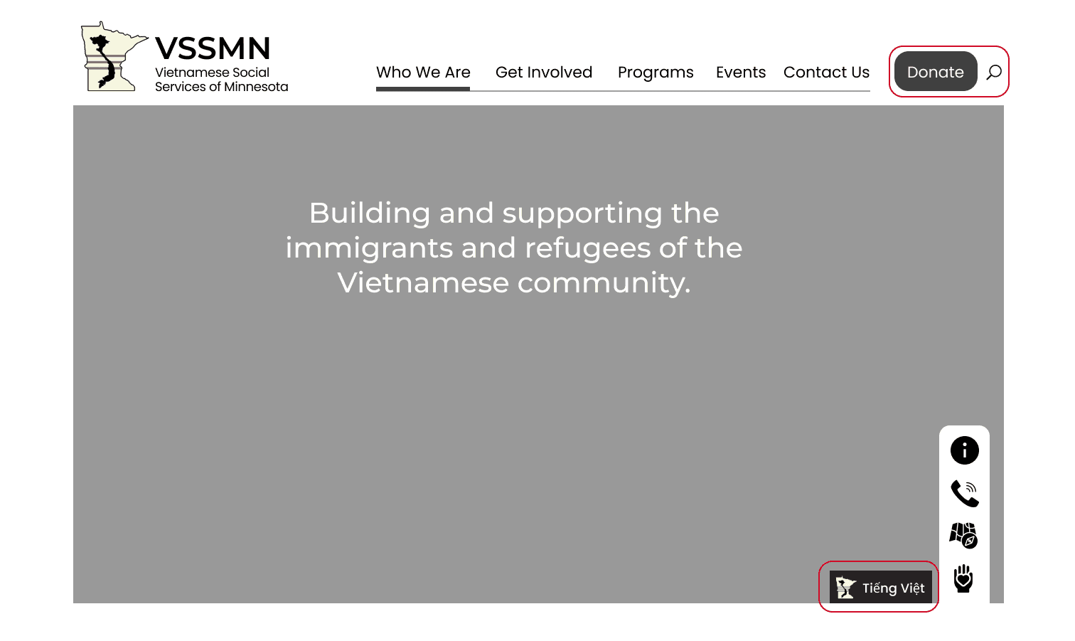
hi-fidelity design and prototype
A close look at the solution for VSSMN
HI-FIDELITY PROTOTYPE
Client
Vietnamese Social Services of Minnesota
Role
UI / UX designer
and researcher
Timeline
4 weeks
Tools
Figma
CONTEXT
Although VSSMN had a strong physical impact, they lacked a digital presence representative of their organization.
VSSMN is a non-profit social services organization that provides resources, programs, and social support to the Vietnamese immigrant community in Minnesota. They strive to empower and equip immigrant families with tools needed to become thriving members of society.
Problem
How might we help eager users easily discover new and lesser known scenic views?
research
A look at VSSMN's current web presence
Users utilize search engines (i.e. Google) to search for locations, but the experience is riddled with friction and frustration. The gaps within the experience reveal major improvements for building our service.
secondary research
Research highlighted the importance of a well established, trustworthy, responsive website that optimizes mobile usage
Website Credibility
75% of users judge the credibility of an organization from their website presence and design (Stanford Web Credibility Research).
Online Presence
Donations online increased by 21% in 2020, compared to the previous year (Nonprofit Source).
Mobile Focus
Website usage for social service organizations increased by 42% in 2020, compared to the previous year (Statista). Within that movement, 50% of traffic to non-profit websites are from mobile access (Nonprofit Source).
competitive analysis
A focus on information architecture, features, and professionalism of existing non-profits
Many of our direct competitors lacked well structured IAs, so I extended my research to indirect competitors - well established non-profit websites with strong digital platforms.
user interviews
3 immigrants between 25-60 years old with past involvement with social services and 2 volunteers between 25-60 years old.
ideation
Information architecture rebuilt for better structure and user flow.
wireframes
Getting into the wireframes, styles, and design
Through competitive analysis and a look into our persona Amanda's wants, I prioritized the must-have features of a functioning location service and the essential task flow - to search and arrive at a newly discovered location.
styles
Working with design constraints for better branding.
VSSMN colors were limited to its current logo, so the design constraints consisted of a pre-determined color palette and logo. I wanted to make sure that the site utilized these accent colors to the best extent without busying each page. Therefore, I opted for red as the primary accent color for all CTAs.
USER TESTING
User testing conducted on mid-fidelity designs with 100% task flow completion amongst users.
1. Donate CTA and search buttons were too close for users to access easily.
2. Users missed the translation option and had trouble locating the button at the bottom of the hero section.
Iterations made before setting up Hi-Fidelity Prototypes.
hi-fidelity design and prototype
A close look at the solution for VSSMN
HI-FIDELITY PROTOTYPE
Client
Vietnamese Social Services of Minnesota
Role
UI / UX designer
and researcher
Timeline
4 weeks
Tools
Figma
CONTEXT
Although VSSMN had a strong physical impact, they lacked a digital presence representative of their organization.
VSSMN is a non-profit social services organization that provides resources, programs, and social support to the Vietnamese immigrant community in Minnesota. They strive to empower and equip immigrant families with tools needed to become thriving members of society.
Problem
How might we help eager users easily discover new and lesser known scenic views?
research
A look at VSSMN's current web presence
Users utilize search engines (i.e. Google) to search for locations, but the experience is riddled with friction and frustration. The gaps within the experience reveal major improvements for building our service.
secondary research
Research highlighted the importance of a well established, trustworthy, responsive website that optimizes mobile usage
75% of users judge the credibility of an organization from their website presence and design (Stanford Web Credibility Research).
75% of users judge the credibility of an organization from their website presence and design (Stanford Web Credibility Research).
Donations online increased by 21% in 2020, compared to the previous year (Nonprofit Source).
Donations online increased by 21% in 2020, compared to the previous year (Nonprofit Source).
Website usage for social service organizations increased by 42% in 2020, compared to the previous year (Statista). Within that movement, 50% of traffic to non-profit websites are from mobile access (Nonprofit Source).
Website usage for social service organizations increased by 42% in 2020, compared to the previous year (Statista). Within that movement, 50% of traffic to non-profit websites are from mobile access (Nonprofit Source).
competitive analysis
A focus on information architecture, features, and professionalism of existing non-profits
Many of our direct competitors lacked well structured IAs, so I extended my research to indirect competitors - well established non-profit websites with strong digital platforms.
user interviews
3 immigrants between 25-60 years old with past involvement with social services and 2 volunteers between 25-60 years old.
ideation
Information architecture rebuilt for better structure and user flow.
wireframes
Getting into the wireframes, styles, and design
Through competitive analysis and a look into our persona Amanda's wants, I prioritized the must-have features of a functioning location service and the essential task flow - to search and arrive at a newly discovered location.
styles
Working with design constraints for better branding.
VSSMN colors were limited to its current logo, so the design constraints consisted of a pre-determined color palette and logo. I wanted to make sure that the site utilized these accent colors to the best extent without busying each page. Therefore, I opted for red as the primary accent color for all CTAs.
USER TESTING
User testing conducted on mid-fidelity designs with 100% task flow completion amongst users.
1. Donate CTA and search buttons were too close for users to access easily.
2. Users missed the translation option and had trouble locating the button at the bottom of the hero section.
Iterations made before setting up Hi-Fidelity Prototypes.
hi-fidelity design and prototype
A close look at the solution for VSSMN
HI-FIDELITY PROTOTYPE
© 2024 Pamela Hsiung