Seenic
end to end design
A scenic discovery app that curates recommendations based on users' interests to help travelers find meaningful, less-visited places that match their personal preferences.
ux / ui design
ux research
4 week timeline
figma
photoshop
miro
While popular travel destinations and well-known landscapes are relatively easy to find, it is difficult to search and locate off-the-beaten-path scenic views, let alone navigate to them.
Seenic emerged from the desire to simplify this process and offer users a seamless experience in discovering new and lesser-known scenic views.
Current search experience filled with friction and frustration.
Users utilize search engines (e.g. Google) to search for locations, but the experience is riddled with friction and frustration. The gaps within the experience reveal major improvements for building our service.
user journey map
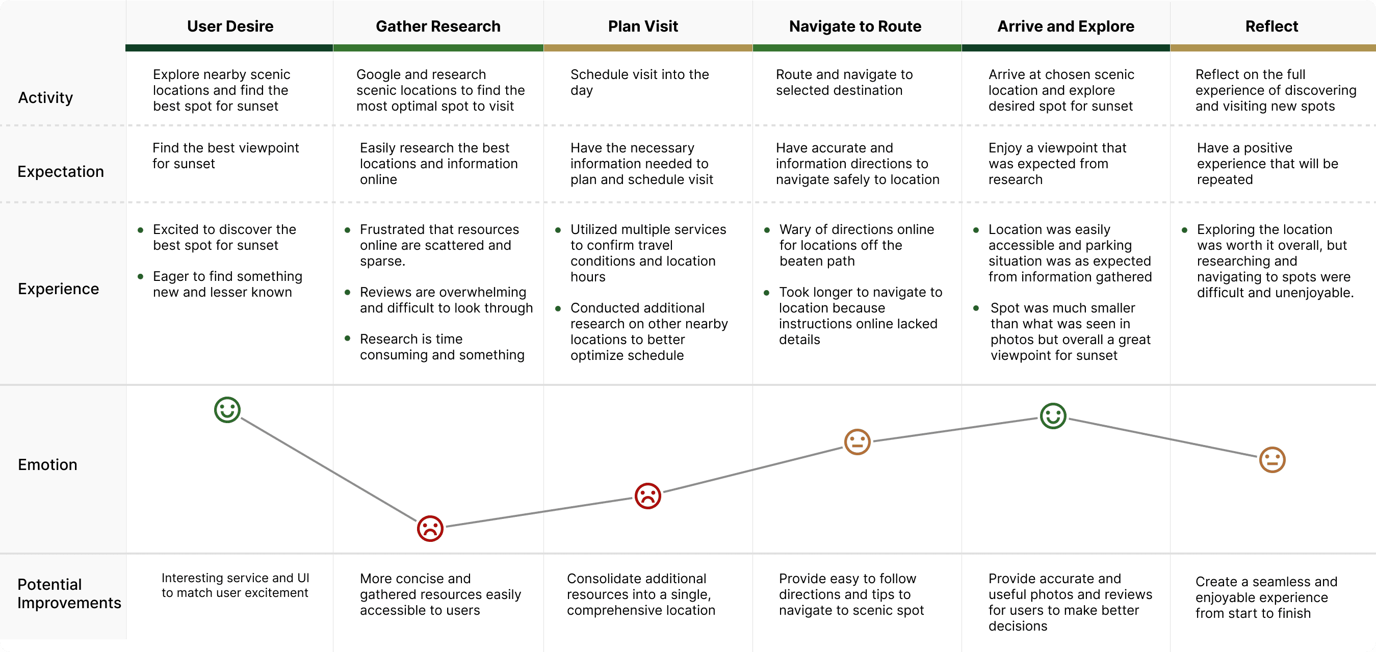
Users begin searches with enthusiasm and end frustrated with mediocre results.
4 key pain points uncovered through interviews.
6 interviews were conducted with users who researched and visited scenic locations within the past year.

Time-consuming Research
6/6 users were frustrated by the difficult research process and switching between platforms.
Unreliable Navigation
6/6 users faced inaccurate navigation and had trouble reaching their destinations with conventional services.
Disorganized Reviews
5/6 users felt overwhelmed by the volume of scattered reviews.
Inaccurate Visuals
5/6 users found that photos were difficult to find and often failed to accurately depict a location.
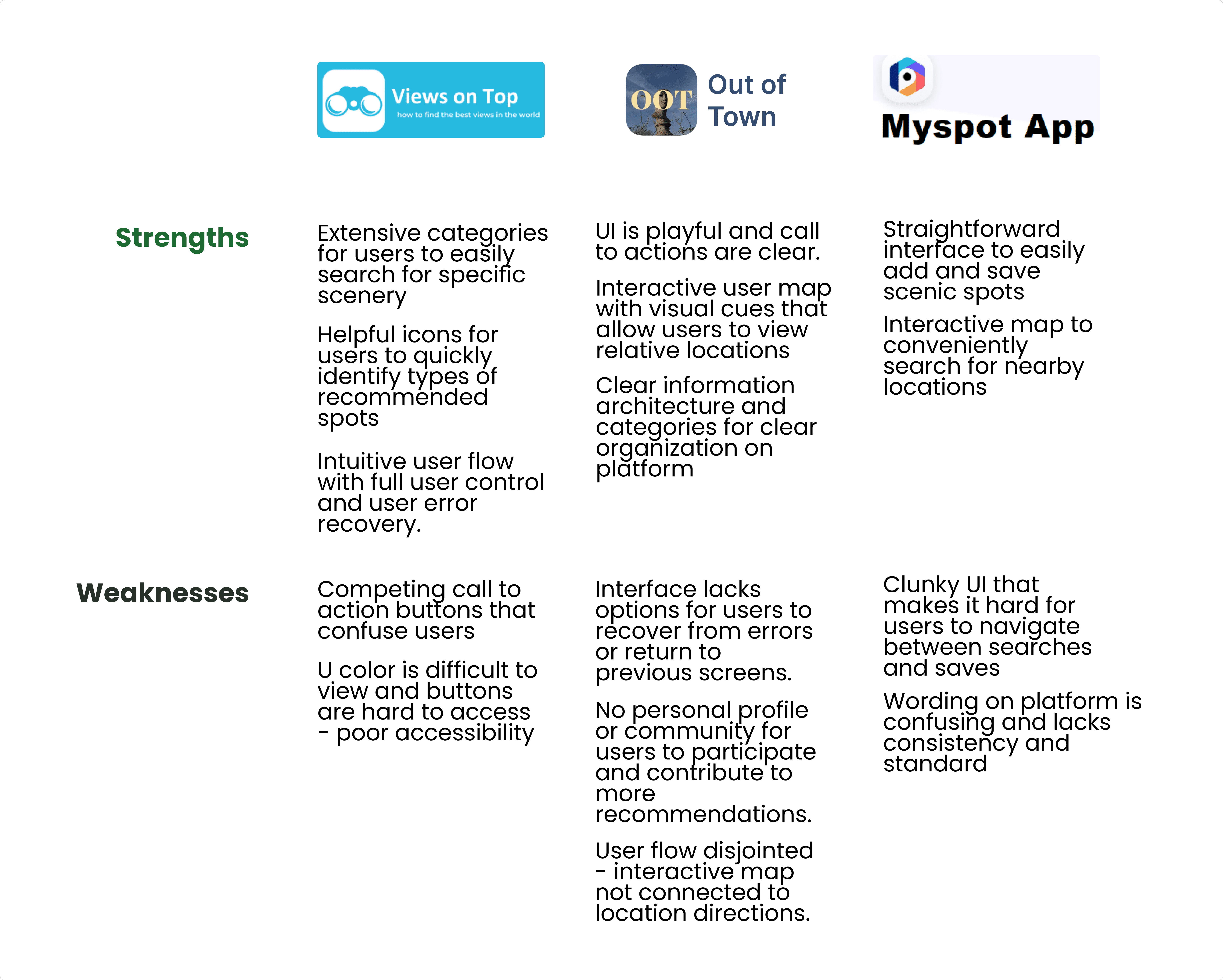
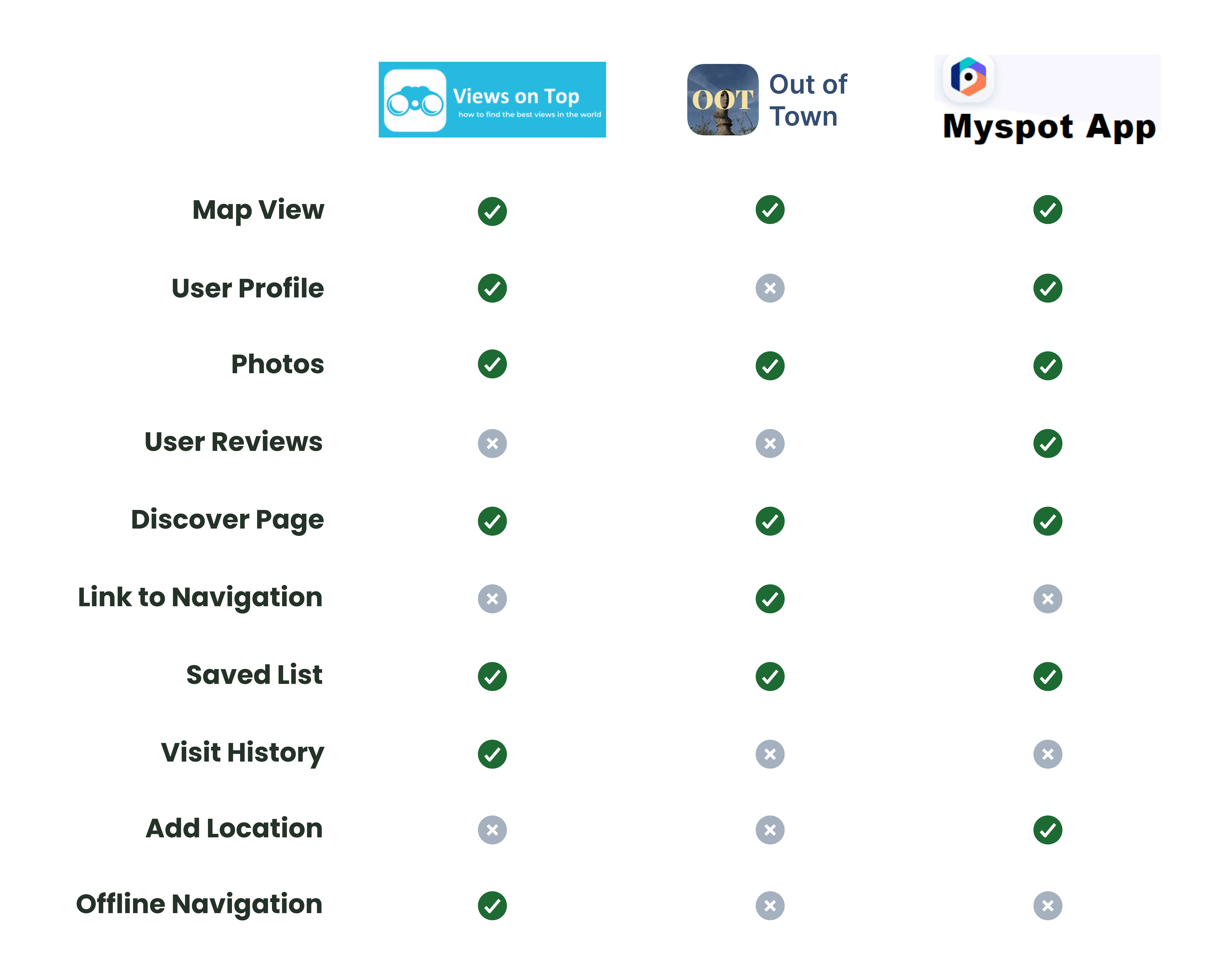
Current market lacked a comprehensive platform to support discovery from start to finish.
A competitive analysis revealed a lack of comprehensive platforms that consolidate scenic information, highlighting opportunities for user-generated content, visual navigation, and organized reviews.
competitive analysis and feature matrix
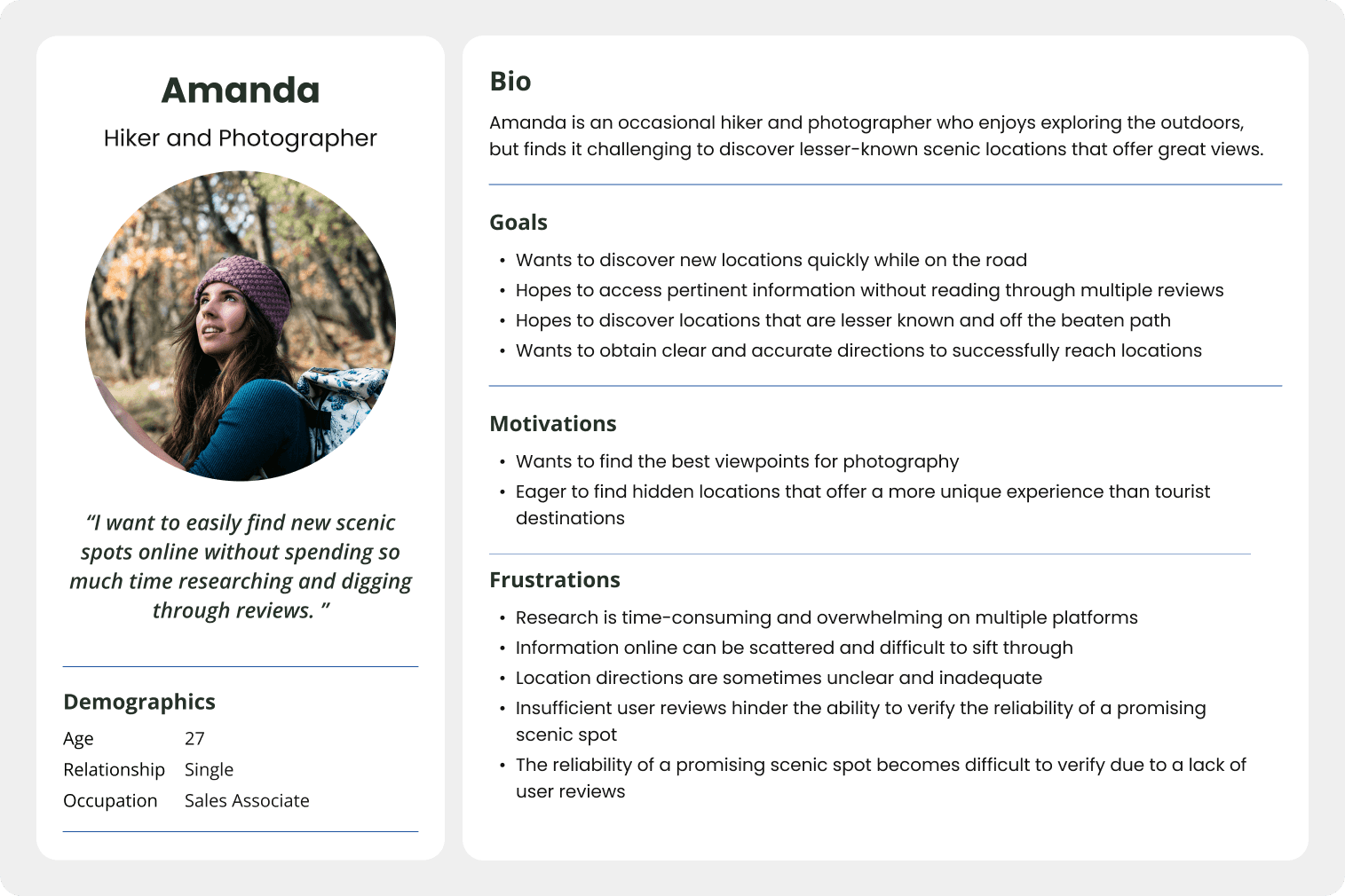
Focusing on the target audience.
Through interviews and research, a user persona was developed to encapsulate a collective experience, encompassing the frustrations and motivations of all users.
user persona
how might we
How might we help eager users easily discover new and lesser known scenic views?
solution brief
A centralized platform that streamlines the discovery process by consolidating information, user-generated content, and easy navigation features.
Ideation, flow, and wireframes for design brainstorming
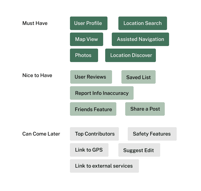
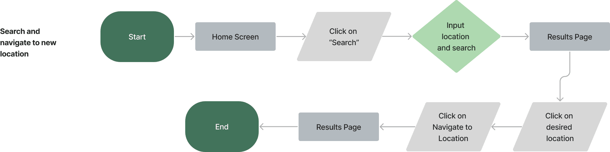
Gleaning in our research and analysis, I prioritized the must-have features of a functioning location service and the essential task flow - to search and arrive at a newly discovered location.
priority matrix
task flow
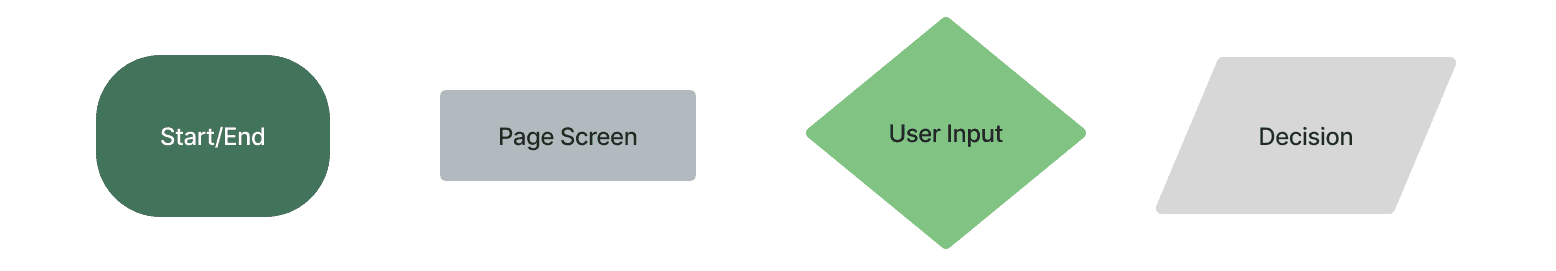
wireframes
Iterations and additions through user feedback.
User testing conducted with 5 users on mid-fidelity prototypes with 100% task flow completion rate.
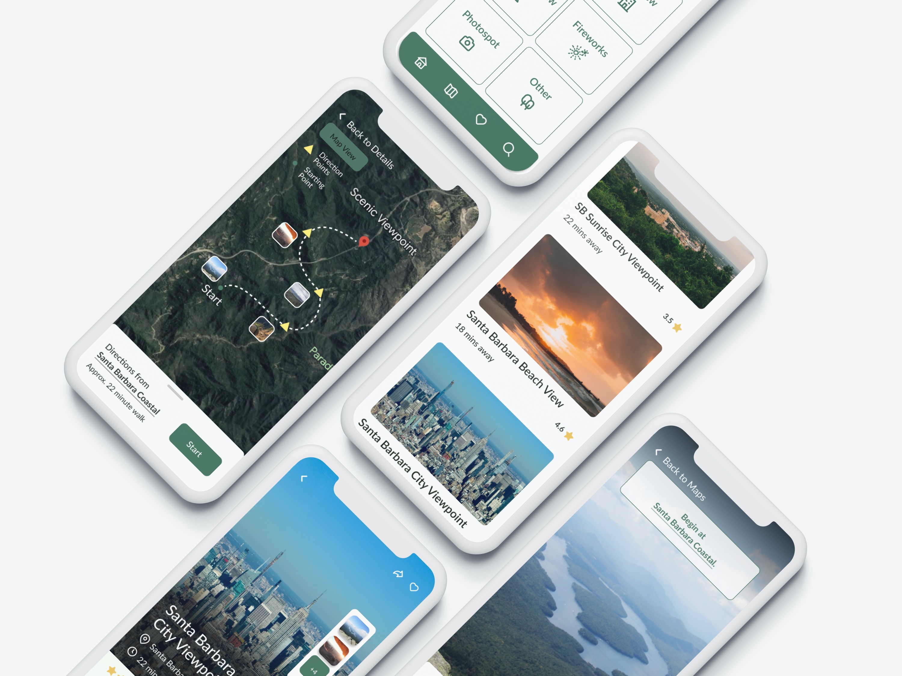
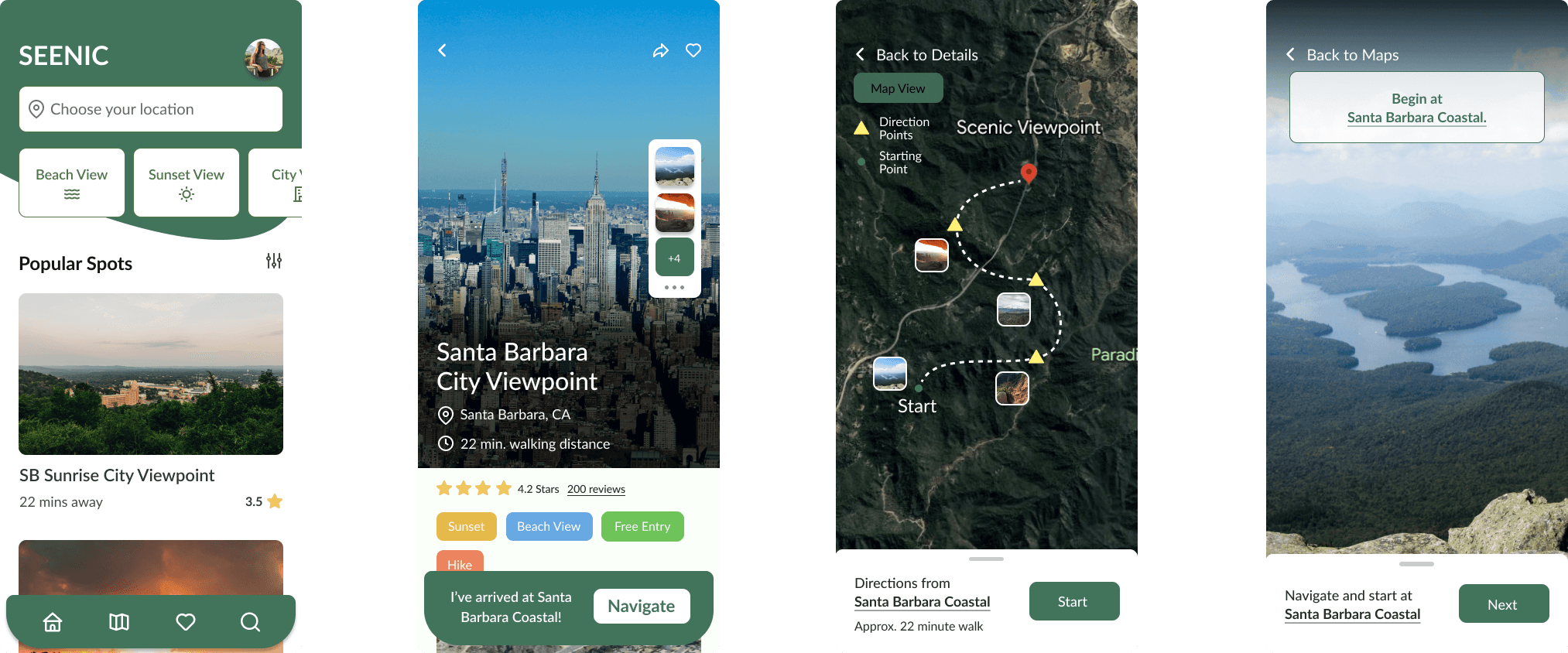
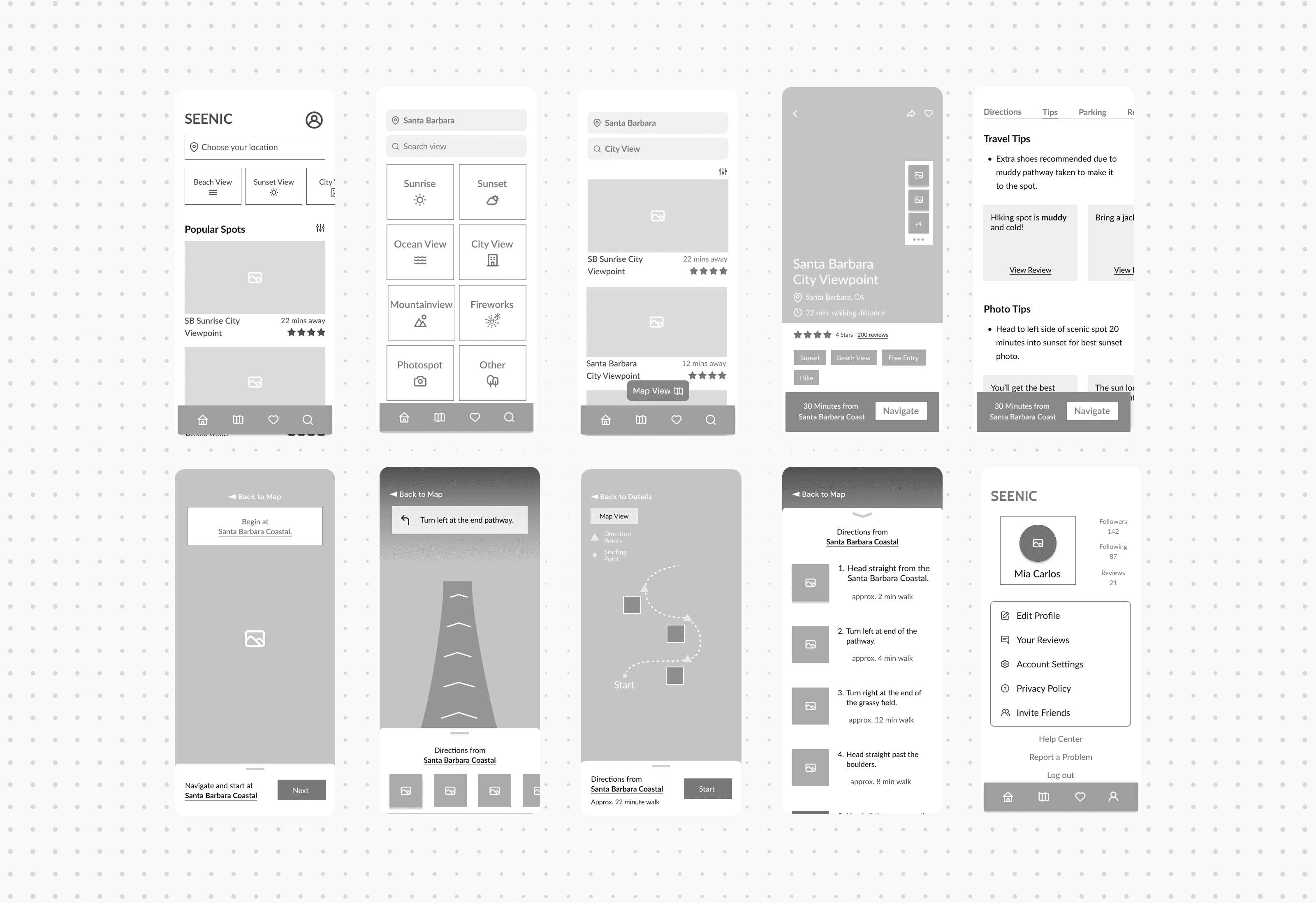
A look at the final Hi-Fidelity Designs
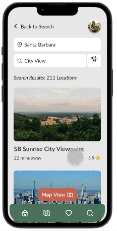
Consolidated Location Results
Categories and consolidation allow users to easily search and explore specific scenic locations
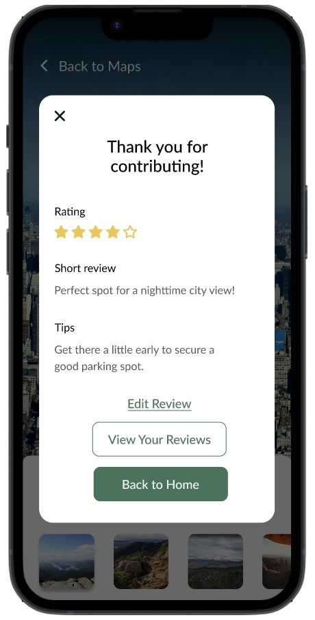
Enhanced Review Filtering
Tips and tricks highlighted under Reviews for easy access
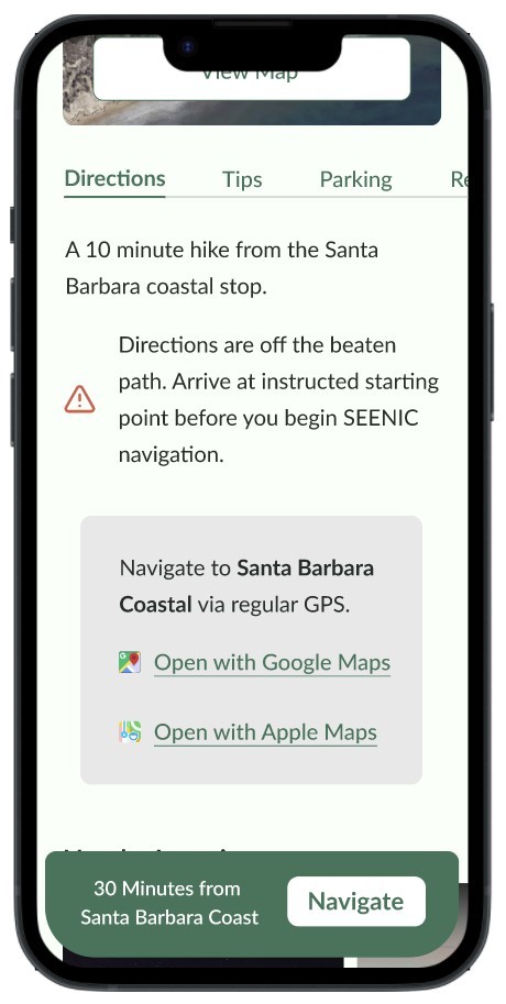
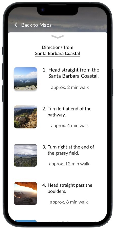
Offline Visual Navigation
Visual navigation allow users to access directions unavailable through conventional GPS

This project emphasized the importance of a user-centered design approach. Continuous feedback was essential in shaping the final product. Key lessons learned include:
Documenting design iterations clearly aids future handoffs.
Focusing on understanding user needs through comprehensive research is critical before diving into design.
Future Directions
Plans include enhancing community features, integrating advanced navigation technologies, and collaborating with local tourism boards for broader reach. A roadmap for these developments is being created to ensure a structured approach.
Visuals and Quotes Integration
Integrating user quotes throughout the study adds depth and personal connection, enhancing the narrative and engaging the reader.
© 2024 Pamela Hsiung